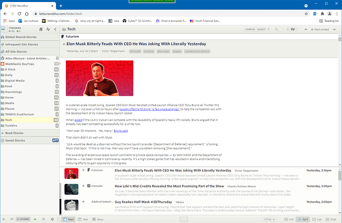
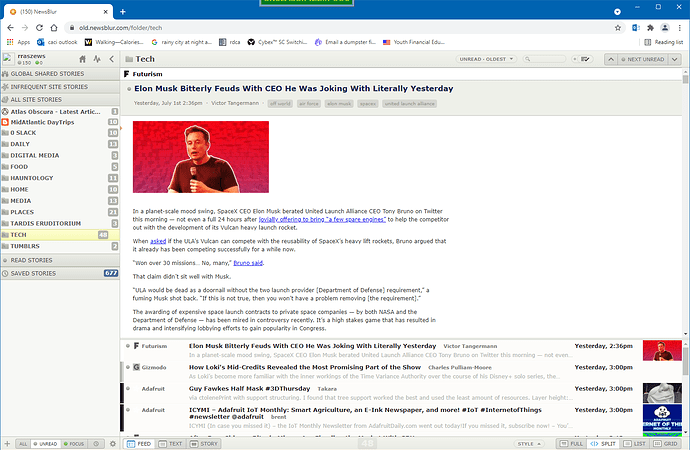
I use the web version on windows. Today there is anew font. It’s blurry and hard to read. Really frustrating since this is reading app. Is there a way to go back to the old font?
Hi, I’d love to see what you mean by blurry. Can you post a full browser screenshot?
Is there a way to privately do that without sharing the feeds I have publicly?
Of course, email it to me: samuel@newsblur.com
I came to post a similar thought; all text is blurry for me. I’ve tried different browsers and PCs with same result. No combination of font family or text size changes help either, unfortunately. I’ll send a screenshot via mail as well if that’s ok?
Please do! And if you can, please also send a screenshot of the same thing on old.newsblur.com so I can see the difference. Yes, it still exists but don’t get too comfy with it. I plan to take it down soon.
can you suggest a a bit of custom css i can load to switch all the UI bits you’ve switched to whitney back to whatever they were before? i know there’s a font family setting, but that doesn’t seem to affect the ui. i’m not finding whitney to be blurry, technically, it’s displaying fine. it’s just a poor choice of font for readability.
I’m having the same problem. It’s not blurry so much as it’s just much harder for me to read.
I think the problem is that it is rendering extremely thinly (at least for me), making it hard to read. I added a css rule for newsblur.com with the following contents:
body{ font-family: Verdana !important; }
.NB-feed-story-content { font-size: 12pt !important; }
This is not the same as before, but I generally find Verdana to be very readable on Windows. It was important to raise the font-size value, because even with a different font it was still hard to read because it was so small (12px is much smaller than 12pt).
I’m willing to share. I literally can’t read the text with the new font (vision problems) at the default zoom. Also personally I find the font ugly, but I’ll grant that’s a “me” problem.
I’m on a Mac with a retina display, and even if the Whitney ScreenSmart is not blurry, it is less readable for me than the Lucida Grande of the old version. The new font quickly causes me eye strain (I’m not young anymore…). It would be nice to be able to easily change the default font globally in the preferences.
Oh, I just discovered the style menu at the bottom right!  It solves my problem.
I suspect the problem is that you’re testing on a Retina level display on the Mac, and when testing for Windows you’re only testing on Parallels on the same Mac. You need to use Windows with a 98 dpi non-Retina device–or boot into Windows on an older non-Retina Mac.
Windows has always looked “sharper” on lower DPI, non-retina devices–since Windows uses subpixel antialiasing more aggressively than OSX/macOS. Now of course the Mac no longer uses any subpixel antialiasing after Mojave. The new beta.newsblur.com basically makes Windows looks like a Mac – i.e., no subpixel antialiasing at all.
Please don’t turn off old.newsblur.com until this is fixed–the new beta is unusuable on Windows with low-DPI/non-Retina devices.
My situation is I find the font on old.newsblur.com much more readable - I would love the option to have that font instead, if it’s available in the settings as an option to switch to, let me know. I also lost a couple of preferences, but by checking old.newsblur.com I was able to restore them, so all fine there. thx for leaving that up for a bit, it’s useful to have that to compare settings etc.
IMPORTANT ADD: I have played with the font style options, but they don’t appear to have any impact on the overall font or appearance.
As a sidenote, the Evernote shortcut plug in is still broken.
On my Firefox browser on Windows 10, old.newsblur.com renders .feed_title as: Verdana.
beta.newsblur.com renders .feed_title as Whitney SSm A.
It looks like Whitney SSm A from typography.com doesn’t seem to support TrueType subpixel anti-aliasing, which looks absolutely horrendous.
Solution: give Windows users the ability to revert back to Verdana for interface elements such as .feed_title et al, as I’m sure a large amount of users like me probably don’t care about how it looks, so long as it looks sharp and legible. Windows users tend to like sharpness (i.e., conforming to the pixel grid) over the accuracy of font rendering–and as I understand, since Mojave, the Mac has gotten rid of sub-pixel font anti-aliasing all together. Most of the world still use 96 dpi displays and not retina displays. And for me, until the 32" 8K display become cheaper so that 3 of them wouldn’t cost more than a family sedan, I won’t be upgrading either.
TLDR: I solved the problem by forcing beta.newsblur.com to render using Verdana which supports TrueType (Microsoft’s subpixel rendering technology) and now everything looks crisp again.
LONG FORM:
So I checked the look and feel of old vs beta.newsblur.com with Chrome on Windows 11 (I use Firefox) and indeed the same problem occurs–everything on beta.newsblur.com looks “blurry” as @jim6 has stated.
So tried a solution. I hit F12 and changed the following:
body {
font-family: ‘Whitney SSm A’,‘Whitney SSm B’,“Lucida Grande”,Verdana,“Helvetica Neue”,Helvetica,sans-serif;
}
to:
body {
font-family: Verdana,“Helvetica Neue”,Helvetica,sans-serif;
}
And viola! Everything on beta.newsblur.com looks sharp and crisp again.
I suspect that @samuelclay just never had chance to test it on a Windows 10 browser on a 96 dpi non-Retina screen, and Typography.com deserves a slap in the face for offering fonts that don’t do proper subpixel hinting and not warn people about how crappy it will look on non-Retina displays.
Here’s a detailed explanation on why @jim6 thinks Newsblur now looks “blurry”.
Also, an additional 2 blog posts that helps:
What’s Wrong With Apple’s Font Rendering
Font Rendering: Respecting The Pixel Grid
The style menu lets me change the font, and some of them are an improvement over the new default, but none of them are “Just use the browser’s defaults, you know, the font I chose for myself because it works for me”.
My temporary workaround, is to use the CSS override plugin using this rule:
body {
font-family: Verdana;
}
Don’t even need a plugin for that: Newsblur’s account settings has a place to enter custom CSS/Javascript.


