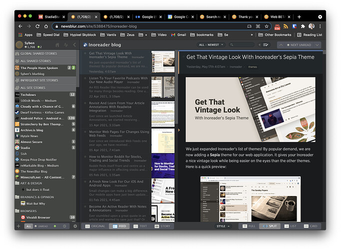
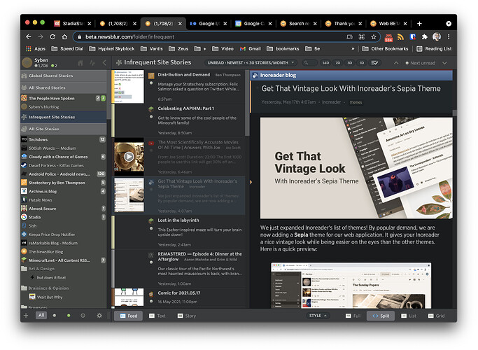
The font size Medium in the current newsblur site for story titles are more closely packed than Extra Small in the beta site. I would prefer having an option to reduce the blank space and have as much information density as was available before.
To clarify, I’m talking about feed titles on the far left.
+1
I don;t really know where to put this comment but here will probably be noticed:
I don’t like the new fonts with the beta site. The fonts on the live site are far better.
+1
I agree. I pack my screens with as much info as possible to minimize my scrolling/swiping/movement.
The new layout has a lot of empty space with no divisions/lines between content. I much prefer to have the split layout with lines dividing content and/or a border around each story.
The new layout looks more like Facebook or similar and that is not what I want out of a news reader.
I got set to take screenshots to show this problem, but you have already called out this issue so no need for more. But want to add my +1. It seems like many redesigns seem to be going this direction, but I find it very frustrating. I have a limited number of feeds in my main folders, just so I can see them all on one screen, and the new design drops two from my screen. I’ll stick with the old one as long as possible, if this is not fixed. . .
There’s been a few other threads on this but I just want to let you all know that a Compact / Comfortable control was added to the feed options popover in the top right of the story titles. That should give you the density you’re looking for.

