Hide/Move the Time in the Story titles View…
I see a lot of Screen real estate being wasted by dedicating a full line to show the Time…
Show it right flushed on the Title Line, or Hide (You could have this as a preference)
Hide/Move the Time in the Story titles View…
I see a lot of Screen real estate being wasted by dedicating a full line to show the Time…
Show it right flushed on the Title Line, or Hide (You could have this as a preference)
Not sure what you’re talking about. Story view basically loads up the original website content (CSS not under control of NewsBlur), and the post time in the titles section (CSS controlled by Newsblur) is right-floated already. That and the current NewsBlur design is going to be replaced with the redesign on dev.newsblur.com Real Soon Now.
Might want to take a screen shot to show what you’re talking about.
Usually the post author and post tags go to the right of the author (at least on dev.). If’s possibly your feed isn’t displaying that information, making that area look blank when it normally isn’t.
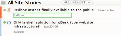
This is what I am using on my Browser to modify the CSS, to save on Space…
Sorry, This is not on the Story itself, It’s on the Titles list controlled by Newsblur…
span.story_date.NB-hidden-fade {
display: none;
}
vs

Yes, I am looking at dev.newsblur, and the Story titles is docked left