This might have discussed before, but here are two things that bother me.
First is changing the “Theme” option, which is really hard to find. Spent 5 minutes trying to find it, not kidding, and when I found it, I realized what the problem was …
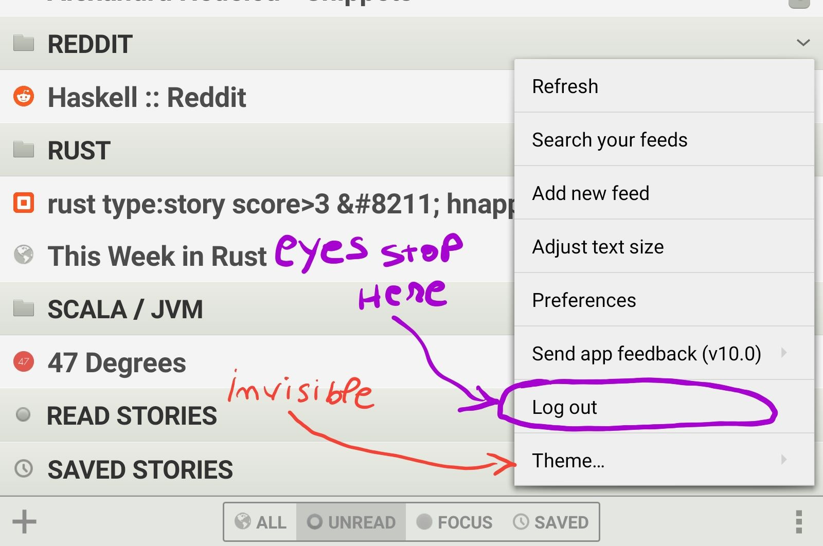
This wasn’t the first time I searched, and then found that option. It never gets easier, because eyes stop reading after seeing “Sending app feedback” followed by “Log out”, as these are the last options in the menu, usually. That “Theme…” option is not where it’s supposed to be.
Another annoyance is that the button for the settings menu changes location, in the main screen (bottom right) versus when reading an article (top right).
The other problem is that, while the Android client has a Dark / Black theme, it’s not integrated with the OS. It cannot automatically switch between light and dark themes, based on the system’s settings. And more problematic for me is that Android thinks its theme is light, so in spite of the system’s settings, it keeps the bottom bar white, at all times …
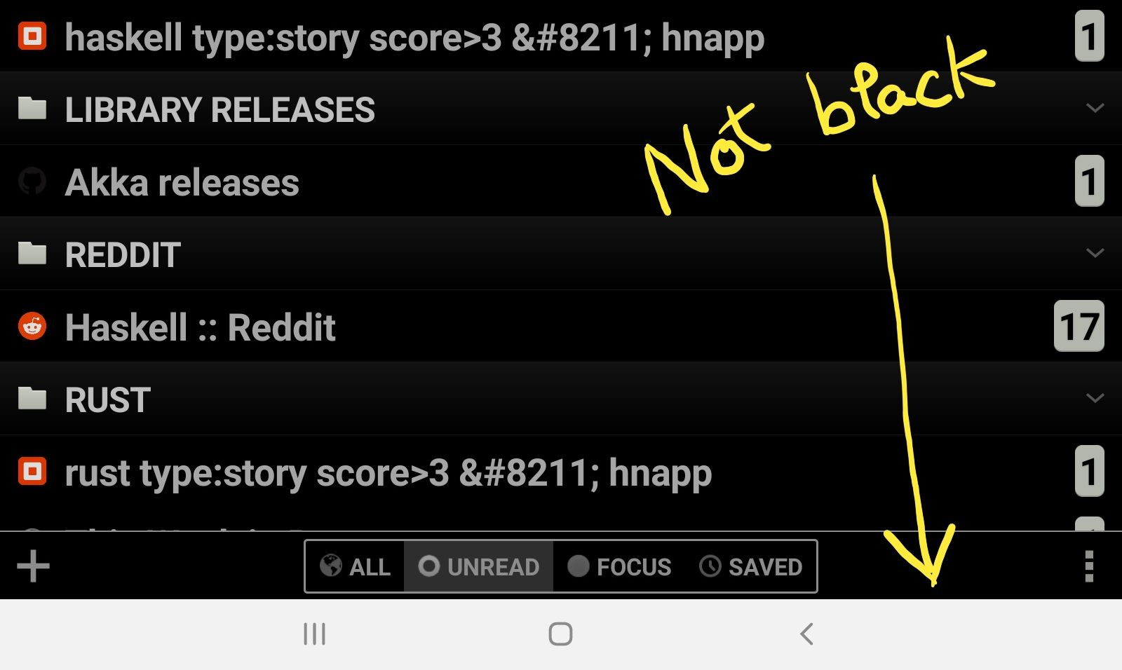
When laying in bed, with the lights off, that bottom bar is like a neon light ![]()
If it makes any difference (and I assume it does), the device I’m using is a Galaxy Tab S7. Not sure if “dark mode” is an Android thing, or a Samsung thing, but other apps are able to set that bottom bar to dark, so I assume Newsblur could do the same thing; and it would be an easy usability win for people using dark mode on top of Android.