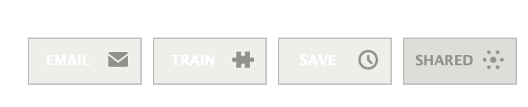
The 3 buttons, “Train this story, Save this story, Share this story” are pretty hard to read with their white text on light grey background. I thought it was just on my modestly-priced laptop, but I checked it out on 4 different monitors between work and home, and it’s the same problem everywhere.
Can we do something to make it more readable? Maybe make the white font dark grey to match the color of the icons?
Other than that, I really like the new design. Great work!
I came here to post this but found your post. I can’t believe this post is two years old and it hasn’t been fixed yet. They are really hard to see and it should be a simple fix.
The hover behavior darkens the background of the buttons and makes the white text of the hovered item visible. It’s an ugliness that I no longer even see. My monkey brain has learned that the middle button is “Save”, even though I can’t read it. Thanks for pointing it out.
So everybody knows, this is completley intentional. You have to see those buttons on every single story, and after a while you know what they do by position alone (with the help of the icon). The text is just to confirm what’s about to happen.
How about making it an option to show the text in darker color? If this is intentional, to make the buttons seem invisible, then why have the darker square box, or the darker icon?
I agree too… having a “empty space” beside the icon made the eye/brain trying to look at the white font and made it annoying when the eye can’t decipher the words.