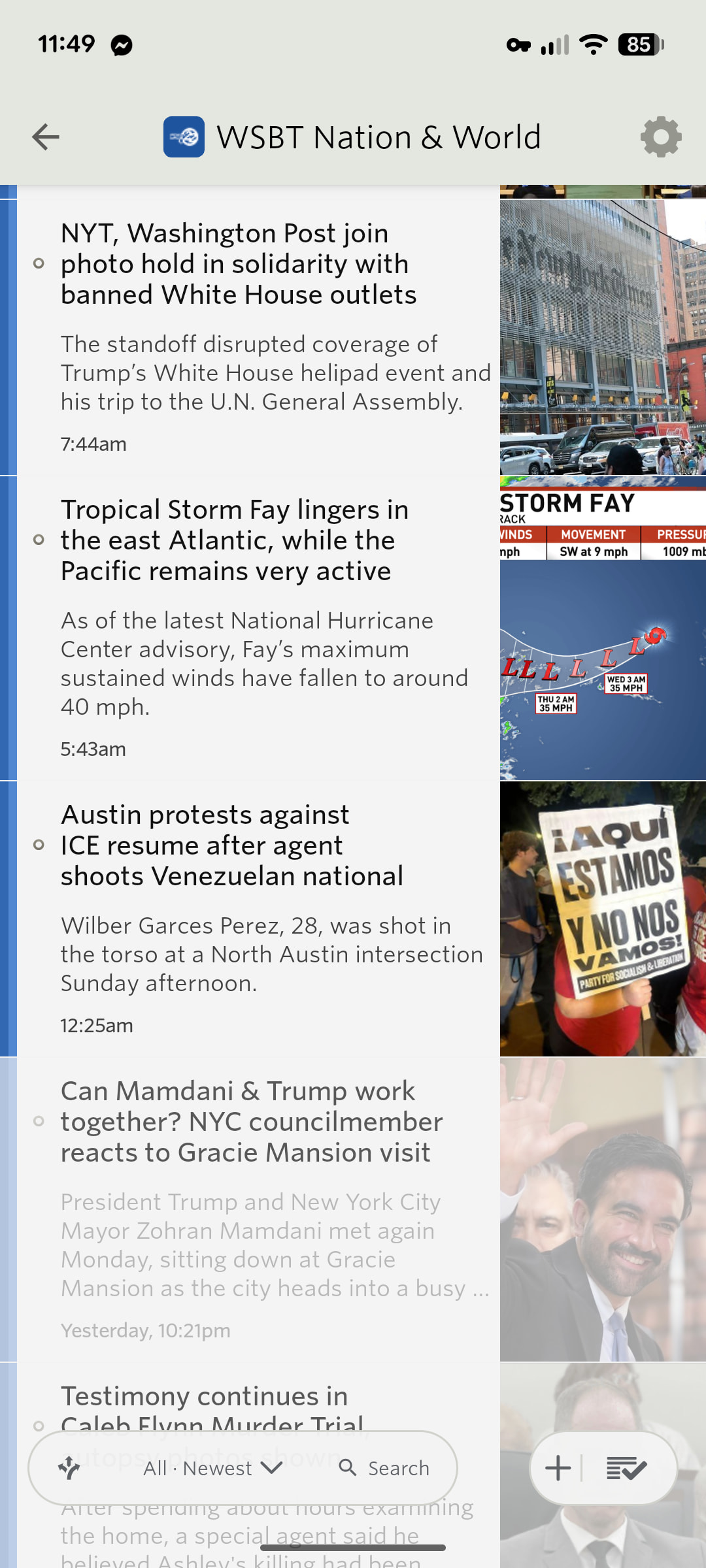
Hi, some quick feedback here. I just got version 15.0.4 and the immediate issue I notice is that when looking at a feed it’s very difficult to quickly tell where the unread stories begin. The unread titles used to be bolder and now they are virtually identical to my old eyes. The only way I can tell the story text is ever so slightly bolder.
I tried different fonts but that didn’t help.
Okay, as I’m writing this I noticed that the left side margin has a color to it so we can see the difference. I could get used to using that I’m sure but a slightly bolder title would be nice too imo.