We have a big update for you on iOS, complete with a redesigned layout engine. You’ll see this mostly on iPad, where you can now interactively swipe between panes, customize how many panes you see, and even customize where the story titles are on the screen relative to the story content.
Let’s take a look at all of the new features, starting with the improved gesture-based layout engine for navigating between stories and feeds.
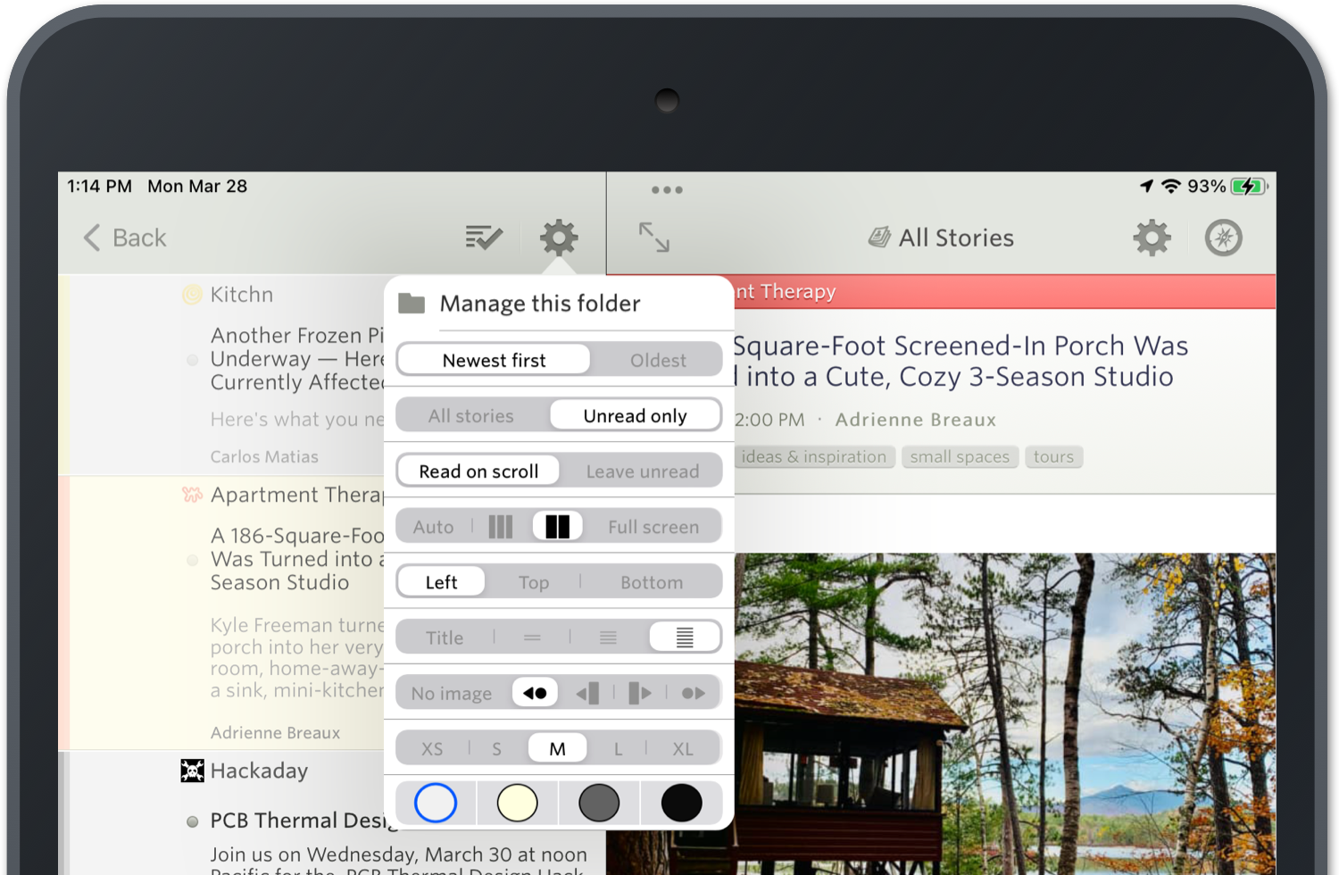
A whole bunch of new controls and customizations have been added to the settings menu in the story titles menu, which is where you can find these new options for 2-column/3-column/full screen view panes.

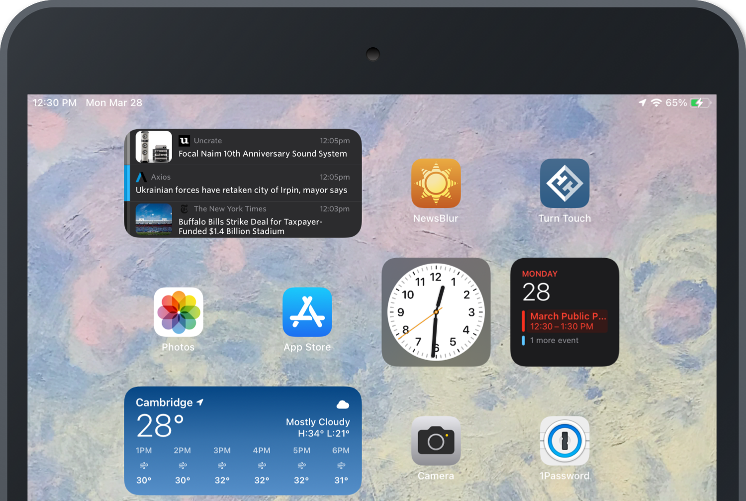
There’s also a new homescreen widget for showing 3-6 stories on your dashboard.

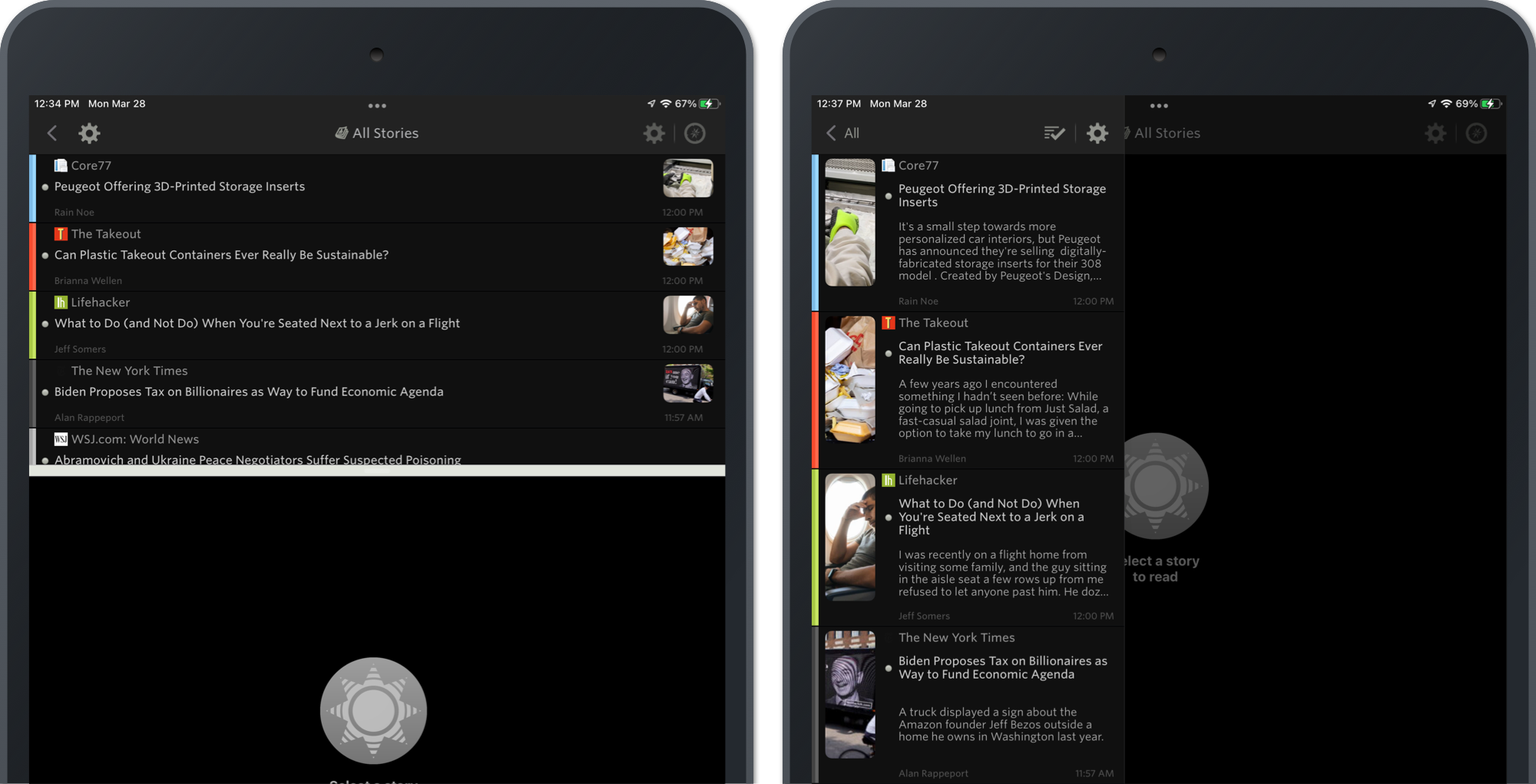
You can also expect to find feature parity with Android and the web when it comes to the new image preview and content preview options for story titles.

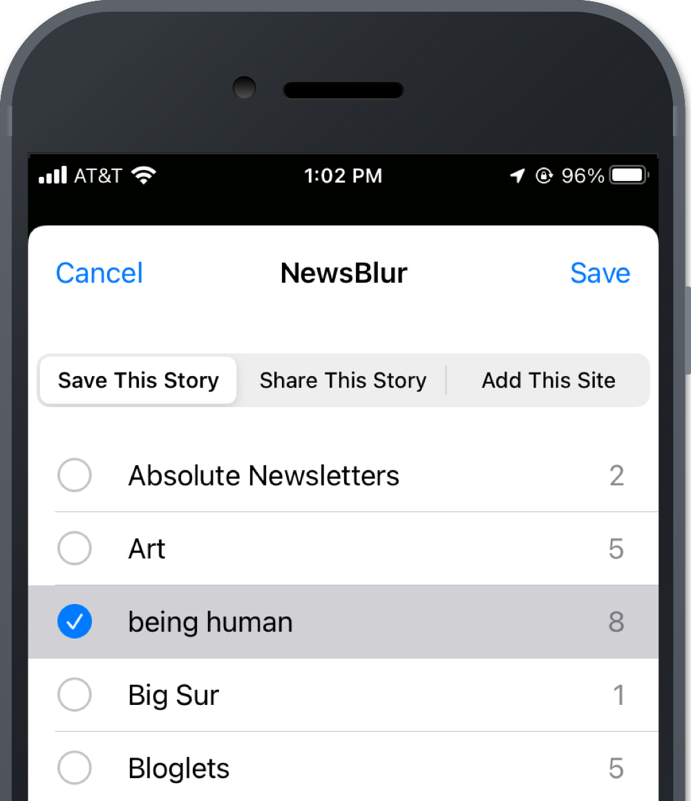
You can now save stories and subscribe to feeds from other apps using the NewsBlur Share extension. This includes your saved story tags and associated counts.

This release also contains numerous improvements, subtle refinements, and assorted fixed bugs.
If you have any ideas for how you would like to see the iPad and iPhone app improved, please post ideas to the NewsBlur Forum. I’m all ears and would love to prioritize improvements or changes that create a better mobile reading experience.
This is a companion discussion topic for the original entry at https://blog.newsblur.com/2022/03/28/redesigned-ios-layout/