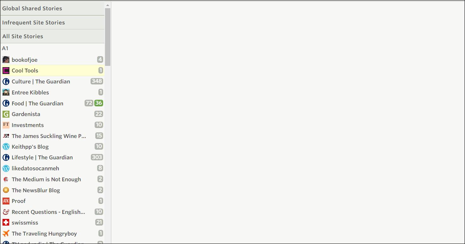
With the latest update the white space in and between the sidebar feedlist menu entries has been noticeably increased, for no apparent reason (other than possibly a “look” preference by the designer). The result is reduce the number of feed items listed on a browser page. This necessitates more scrolling. Sounds like a small thing? Well, it isn’t. Increasing user input (ie. form over function) for no reason not good.
Now I realize that there is likely a custom CSS solution with a lot of effort, but why was this done?
The new design is okay but this spoils it on web platforms.
There’s a preference to accommodate different tastes. It’s in the feed filter popover in the top right of a list of story titles. Choose between Compact and Comfortable.
Found it. It was indeed in Comfortable mode. I am not sure why since I never changed it. I wasn’t even aware of the setting. Anyway, it is now in compact and that is perfect.
I think you’re replaying to an unrelated topic. I too get a blank panel on the right. This appears to be related to a JavaScript function that is too new for my older browser.