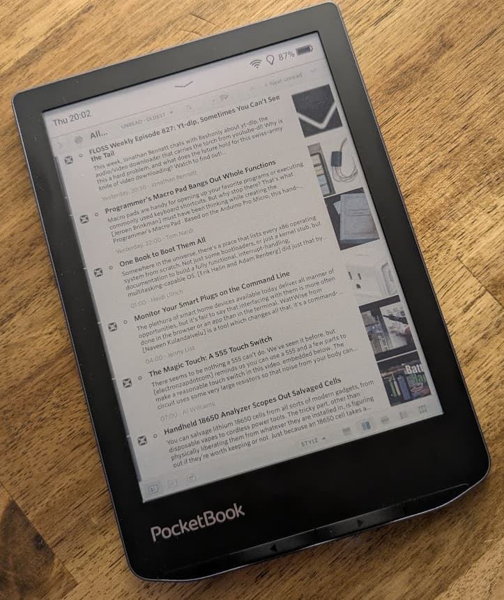
I am using the NewsBlur web interface on an e-reader (Pocketbook Verse Pro Color) in its very limited browser, and it sort of works. In general, everything is very slow (unsurprisingly). However, a specific workflow for scanning headlines of the day’s news and saving interesting items for later seems to work out quite well, and I think it could be improved with a few small changes.
It is possible to open All Site Stories, hide the left sidebar, and enter Split mode. Due to the narrow screen, the actual story window and content remain hidden. This is a good thing, as rendering stories is sluggish (which also makes List mode annoying to use).
Now, after clicking on an item in the list to set input focus, the clicky hardware buttons can be used to advance through the list of stories (they seem to emit page down/up key events). Flipping through the list page by page fast enough to be usable and works quite well! Scrolling with the touchscreen on the other hand is a flickering slow mess, so the hardware keys are a must.
By default, the list is not very readable, as the contrast ratio of the screen is too low. Text needs to be black and the backround must be completely white, which can be achieved with the following custom CSS:
.NB-storytitles-content-preview {
    color: #000;
}
.NB-story-title {
    background-color: #fff;
}
Actually opening news items is not really possible. The browser does not support tabs or going back in history after clicking on an article to open it externally. Going from Split to Full mode takes multiple tens of seconds. With the tiny icons at the bottom, this requires a lot of patience and precision. Going back and forth to read a story is not fun, and moves input focus to the bottom bar, which requires more clicks to get the focus for the hardware keys back into the story or story list for scrolling.
What works reasonably well, hovever, is saving stories for reading later. The context menu is responsive enough to be used. Going through saved stories one by one in Full mode afterwards works nicely for all sites which offer reasonable content in the RSS feed or text view - other devices can be used for viewing all the other interesting things not suitable for an ereader.
Ideally, the whole web interface should be simplified dramatically for such underpowered devices. However, a few tweaks would already accomplish a lot:
-
A Scan mode which just shows a list of items (exactly like the list in Split mode) and offers the “save for later” button directly in the feed on each item - below the icon, for example. This would allow to save stories without having to fuss around with a long press, losing input focus on the list, and so on. Not showing story contents there in general would help with performance.
-
“Page up” and “Page down” software buttons somewhere to use for scrolling by an entire screen height without needing clicky hardware buttons. Maybe replace the bottom bar with an “ereader control” bar offering a few shortcuts (page up/all stories/saved stories/page down) in larger size.
-
High-contrast ereader theme (mostly solved with custom css already)
-
List mode might work in general but the layout is broken and prefers to show the date instead of actual content on very narrow screens
-
Simplified login page (it doesn’t work at all on my old Kindle)
I might try to cobble together an external web interface with the API, but I think there’s a general use case for supporting such devices with a subset of the functionality.
Thanks for the great work!