LOVING the fact Dark mode is officially born into existence on web. I do have a minor suggestion based on my poor eyes:
-
Trained tags are light green/white text, and basically impossible to see:
-
This isn’t a problem at all, but I almost feel like a little definition or line here would look slick:
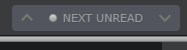
Not that it matters necessarily, unless you want it to, but ADA compliance generally recommends a fairly good contrast between background and foreground. The unread storys grey on white is probably pushing that limit. Its a little hard for me to read, from a distance: