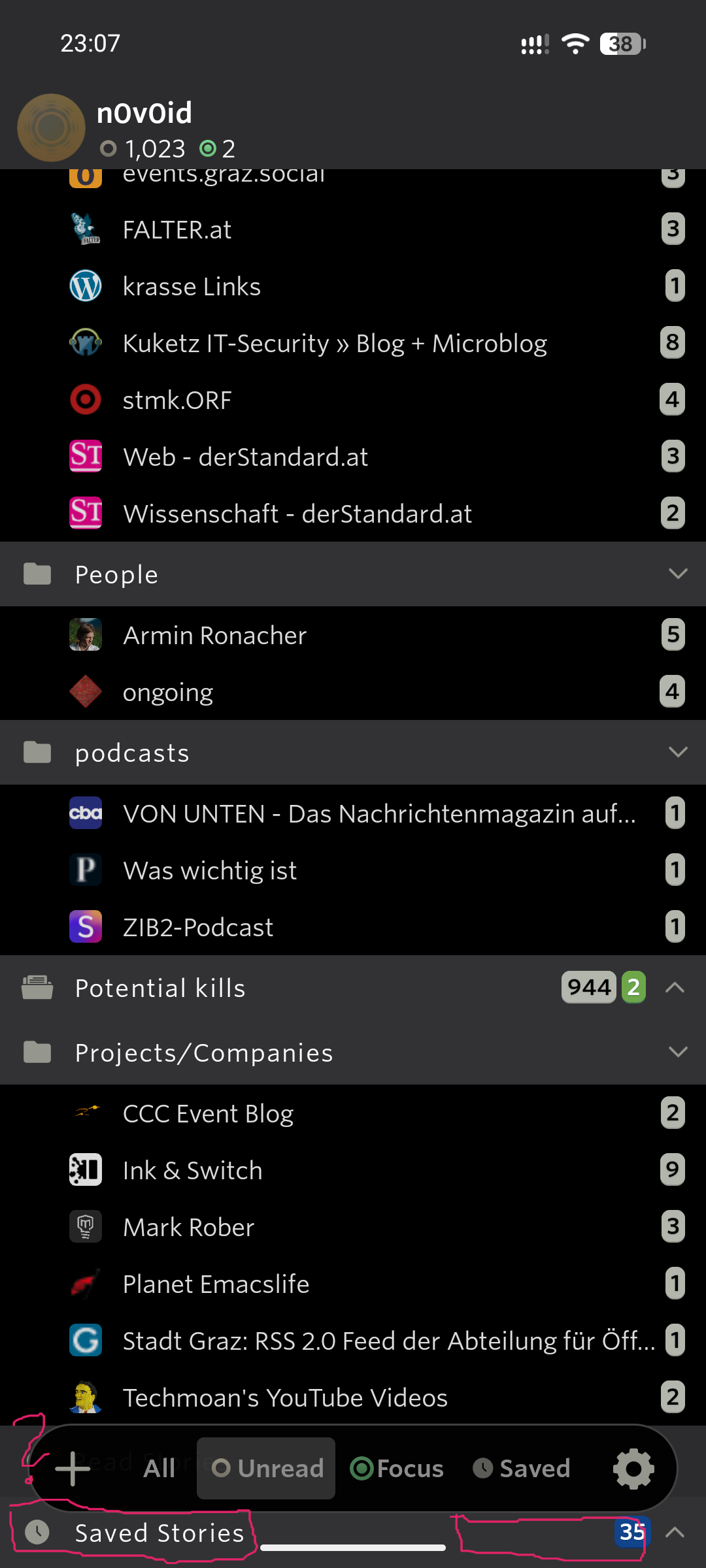
In this screenshot you see that the element below the bar isn’t visible at all, marked by that question mark. So the user needs to scroll around in order to see if there is something important hidden by the bar.
Furthermore, the screen estate which allows for seleting the “Saved Stories” (I use frequently throughout the day!) is very limited to the two small purple areas.
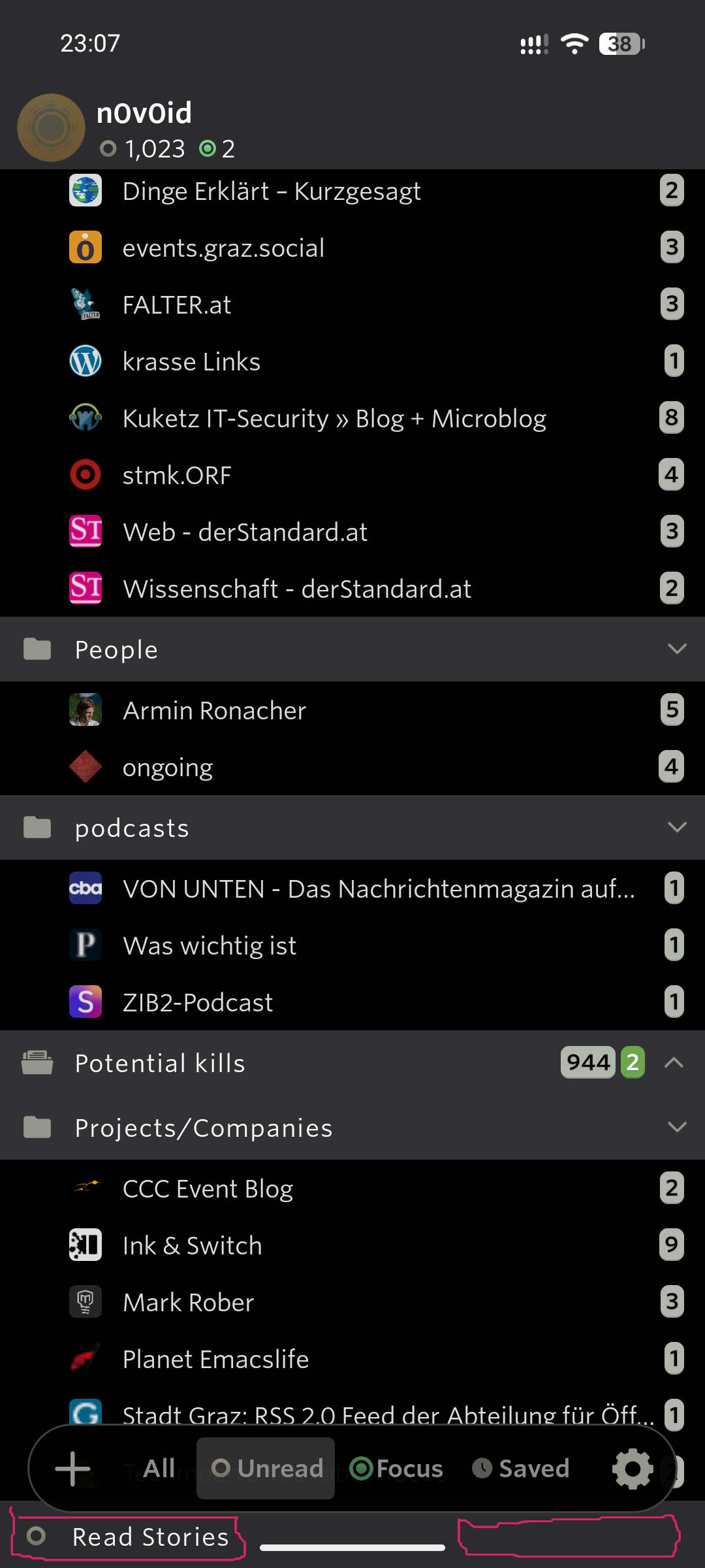
In order to see what’s blocked by the bar, I now have scrolled a bit. And also this element can only be accessed via the two small purple marked areas.
I really don’t see any positive aspect of this design decision to be honest. It divides the content into easy accessible content (above the bar), hidden content (below the bar) and hard to interact content (below the bar).
If there would be a similar option as with the other list view, I could switch to a view where content is never hidden.