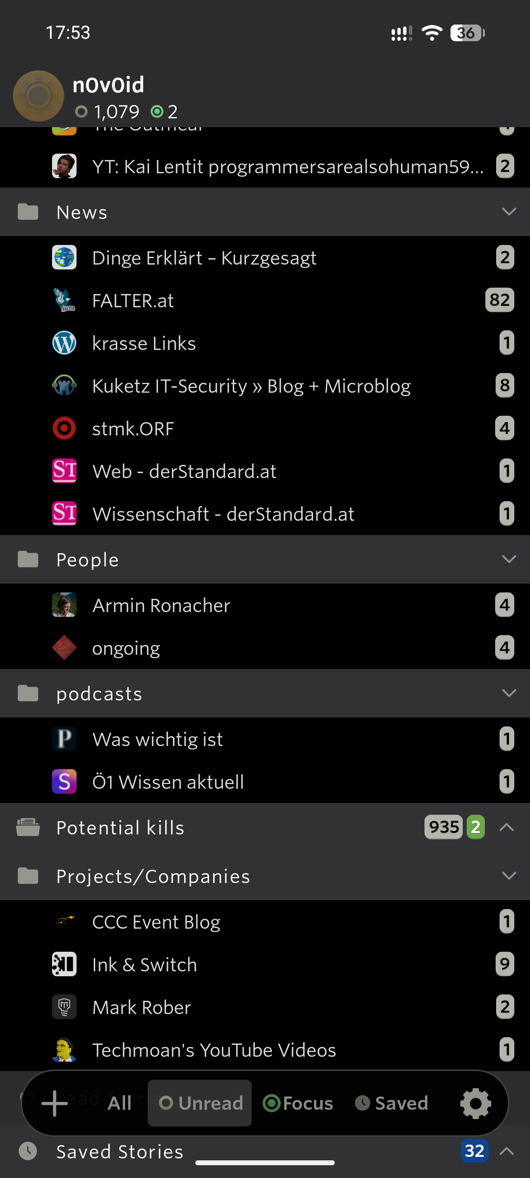
This is how the new UI looks on my side. My issue refers to the bottom button bar (Sorry, I don’t know its designated name) that starts with the + symbol and the All, Unread, Focus, Saved and Preferences.
Inside a feed, this bar migrates to “All Newest”, “Search” and mark all articles as read:
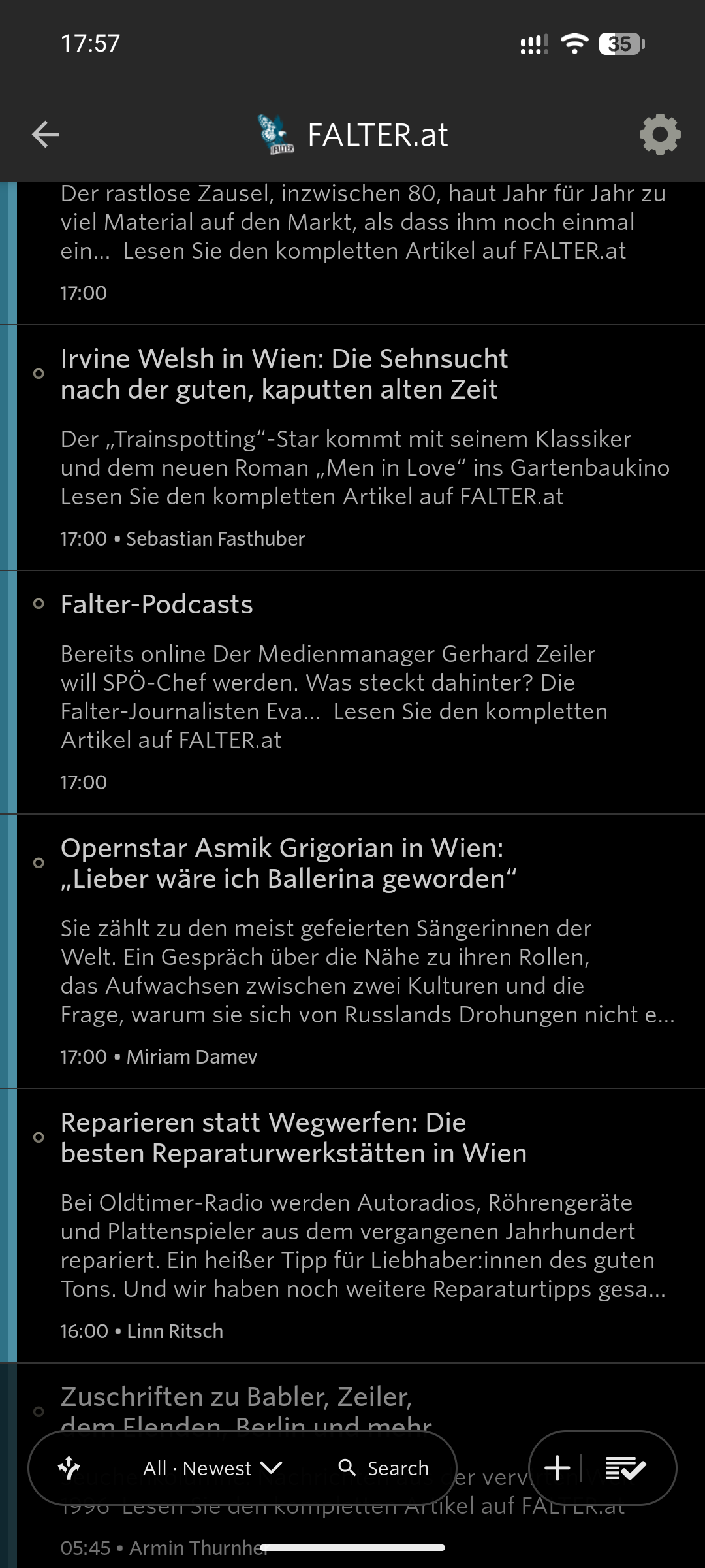
In both views, I do find it hard to select entries from the bottom of a list. Some edge cases are almost impossible to select. I need to move the entries down in order to get them between the absolute bottom below that button bars and try to click on them in the tiny space left without accidentally invoking any NewsBlur button of that button bar or the system bar below.
I’d say this is not an option for smaller screens or older people.
I tried to locate some settings to make this hover bar a normal button bar that does not cover the content of the lists. Maybe I don’t know exactly what to look for.
However, I really would like to change that behavior as it constantly gets in my way the way it is now.