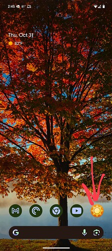
Is there a plan for an adaptive icon on android? (avoiding the need for another launcher) I love the current icon and the colours, but personally prefer a monochrome/minimalist home screen.
Can you post a screenshot of what you’re looking for? I’d be happy to prioritize this request, I just need to know what to build.
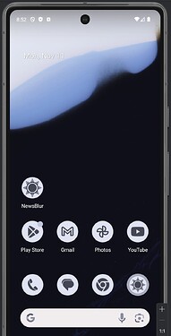
Notice how the Newsblur icon sticks out? The other icons use the Material You theming on the Pixel Launcher. This is also known as adaptive icons. I second this request!
https://developer.android.com/develop/ui/views/launch/icon_design_adaptive
It’s the next item on my list once I finish some testing.
Wow! @samuelclay lightning quick response! It’s cosmetic, so please don’t bump a functional.
And thanks @Shawn_Dreelin for providing the screen shot - exactly right. I actually love the icon and how it stands out against the others…but it draws me like a moth to a flame and I scroll too much! ![]()
@andrei thanks in advance!
Amazing! One request, can we swap in the alternate icon (with the same monochrome filter)?
Beautiful!
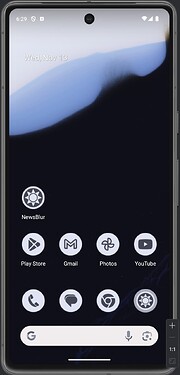
The update just got pushed through, and the icon is now fully adaptive and beautiful and minimalist!
Thanks for the very quick response, I very much appreciate the effort. Job done!


