Web beta: story images wrong size (stretched)

An easy example is the most recent XKCD. Requested screenshot attached. Image is being stretched far beyond its normal size.
I appreciate that you personally feel it is acceptable to stretch images a certain percent, please know this opinion is not universal. I feel that no matter the size, images should never be stretched, only shrunk. Even 5% stretching is unacceptable. If this is to be the default I would very strongly request an option to disable it.

1 Like

I see, you have story titles on the bottom. You’ll want to enable the max-width settings in Manage > Preferences > Stories > Wrap story content at 700px to ease reading.

It could probably stand to be a bit smarter about what images it stretches, maybe a higher minimum size. As an example, macstories.net. The have links to podcast apps, on the non beta site there are four of these images all on one row, all the same size. Beta does this:

Another odd one is rockpapershotgun.com which have 24 pixel tall Share/Save and Email this links which briefly get blown up to max size in every post until the main post image is done loading.

another vote for please don’t stretch images, or allow a setting to disable it.

so the 700px wrap seems to reduce the issue of overly stretching small pictures (more testing needed to determine if all stretching is removed entirely), but now the story text is wrapping early leaving a huge chasm of blank space on the right hand side. This makes it harder to read as there is more scrolling needed. I set my browser at a certain width because that is the width of text I like to read.
Also problematic, now the pictures are all shrunk to 700px. This is a problem for the photographic blogs I follow such as Astronomy Picture Of The Day where the whole point is big beautiful screen-filling pictures.

Why not just give us an option to turn off image stretching? For those of us who deeply care about the photographic arts this is a very big deal. Stretching is bad.

1 Like

If you have Firefox with Stylus installed, or a similar extension that lets you add custom CSS, this seems to work:

.NB-feed-story .NB-feed-story-content img {
    width: auto !important;
    max-width: 100%;
}

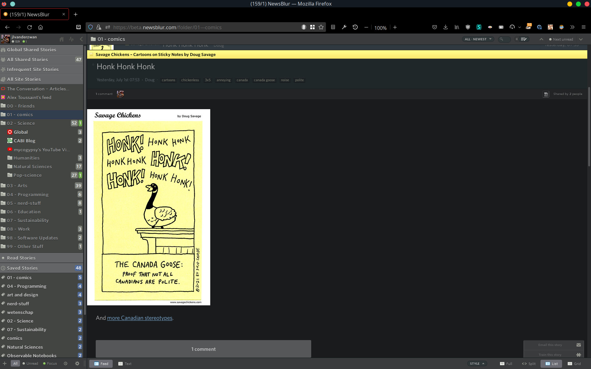
Also, I have a lot of webcomic feeds that are just broken without this custom CSS:
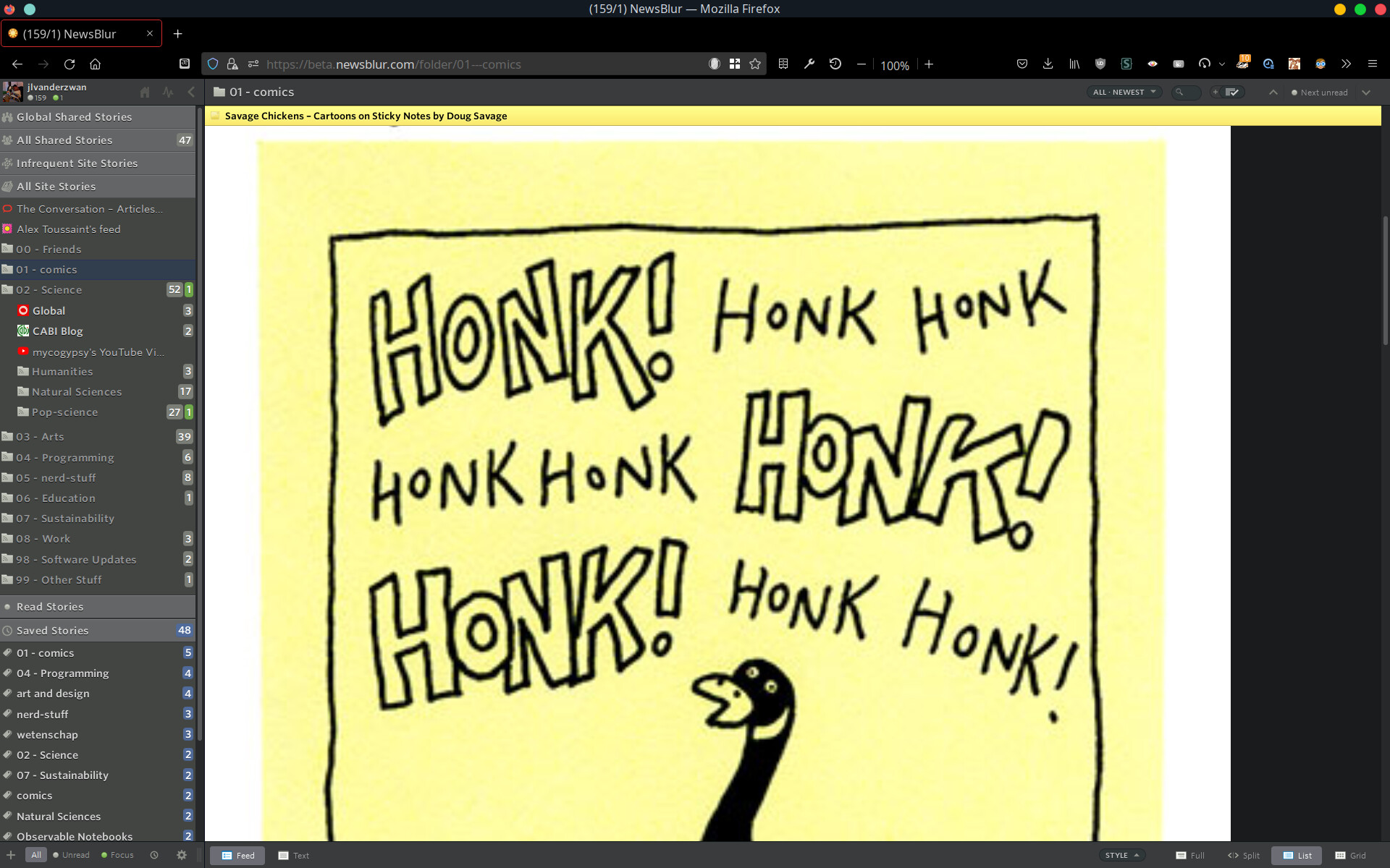
With CSS override:

I’ll address this today, it looks like it’s stretching images it shouldn’t be. Please post the newsblur.com/site/<feed_id> url of any feeds that have this problem and I’ll specifically look at those when I’m fixing it today.

I have the width set to 700px max the images are still stretched and look ugly. Same xkcd.com, Safari on iPad OS.

There should be an option to never up stretch images.

The tip about custom CSS is very helpful, thank you. While I don’t know if my browser supports that I know Newsblur itself natively supports custom CSS. On your account settings (not under Preferences but under Account) there is a place for custom CSS. I just pasted in your CSS and it overrides the stretching. Now my images look like they should no matter which computer I’m on.

I still think there should be an option to just turn off the stretching, for others who are not keen on the custom CSS fix, but this at least works for me.

Also, nice to see a fellow Savage Chickens reader. :smile:

2 Likes

For my examples:
newsblur.com/site/7808652/
newsblur.com/site/6101307/

I recommend against using Custom CSS for this issue, because it will eventually break and now is one of those times. Better to work with me and get it fixed for everybody so you don’t have to worry about supporting a one-time fix that I have no insight into.

I just deployed a fix for improperly sized images. Remove Custom CSS and reload the site.

1 Like

Yep, that works for my comics feeds! Thanks!

Removed custom CSS and checked a few sites and stories with various window sizes (apod is a good source for images bordering the view area size for edge case testing). Now it appears to either leave images alone or shrink too-large images, which doesn’t introduce distortion and would generally be normal browser behaviour with images too large to display. Images smaller than the viewing area appear to remain their normal size. This is good!

Thank you for no more stretching of smaller images to fit the viewing area. As mentioned above, I can acknowledge there are those who might want that. Perhaps reintroducing the feature as a configurable option might work well?

Is there a way to revert to the prior format? I’m using a macbook pro and the new format strtches so far that the icons on the top right are off the screen. Thanks for your help. Mark Oland

Images are still shown with full bleed (no margins) if they are big enough. So this is basically the old behavior except when the image is big enough, and then the margins are adjusted. Shouldn’t be anymore stretching, and certainly not shrinking. If that’s the case, share the url here so I can take a look and fix it.

Mark, make sure you reload the page, it should now be working as you’d expect it.

Macstories is a good example of a feed where the images are being shrunk. Note this does not need to be “fixed”.
https://beta.newsblur.com/site/6720138/macstories

Their posts have an image at the top and that image is generally 6k or more across. Clearly this is larger than the view area on Newsblur and the image is being shrunk down to fit in the viewing area. This is the same behaviour as when the browser just opens the image alone in a tab, it gets shrunk to fit on the screen. Also the images are shrunk in their original context on the host site. They clearly intend for the image to be delivered oversized and then shrunk as needed when displayed. Since shrinking images doesn’t introduce distortion like stretching and it is normal behaviour in other contexts it is reasonable to do so here.

Both of these screenshots look correct to me:

Confirmed, those are correct (and what I see on my end). The images are being shrunk to fit the view area from their original size of 6k pixels across, as is reasonable. If displayed at true size they would greatly overflow the view area and introduce horizontal scrolling.

I’m still having some issues with too-big images. It only ever happens with large images that are in portrait orientation. I’m not sure that “if it’s large enough we should make it too big to fit on the screen” is a good rule of thumb, especially if the image itself is a screenshot of text.

Here’s an example:

And here is the same image in context on the original website:

There isn’t any situation where a vertical screenshot of an iPhone screen should every be stretched “as wide as possible because it is a large image”.

If you insist on sticking with the “full width images are the defining design characteristic of NewsBlur and must be kept” then I’d prefer these rules:

  1. If the image is much wider than tall (like 16:9 landscape and wider) then make the image full width.

  2. If the image is nearer to square (like 4:3), square (1:1) or tall (9:16) then NEVER make it full width. Only ever show it as wide as the text surrounding it.

It is possible that someone is including an image in an article so tall that they expect people to scroll to see the bottom. But in almost ALL cases, they want the viewer to see the entire image at once. For any photograph this is true. As a viewer, I NEVER want to have to scroll to see the bottom part of an image, and always want to see the entire image at once if possible.

Here is a SQUARE image, some album art, which is stretched out so much I can’t see all of it at once:

When I try to use CMD+"-" to “zoom out” to make it possible to see the entire image, it just messes up the whole website. I shouldn’t have to reload the page to get the website back in working order:

Apart from the ongoing image-stretching design choice, and the lack of a “let me block/never see this user again” feature, I’m a very happy customer of NewBlur!