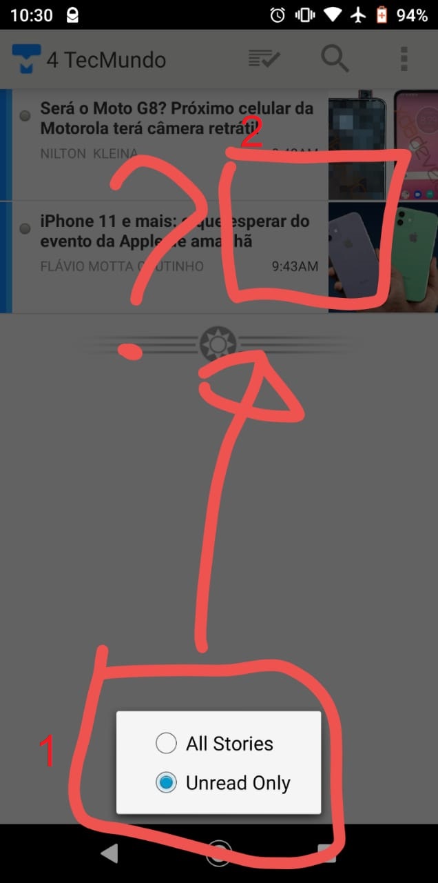
When I click in Read Filter the options box appears at the bottom of the screen but I believe that would be better if the box was shown in the top right, in the same position as when you click in the “theme box”…
You mean in the feed list? That position matches the web and iOS and it helps serve as a visual indicator of which view you’re in (feed list, story list, story detail) without having to think about it, due to the shape.
I’m talking about something else,let me explain with screenshoots, will be easier to understand that way.
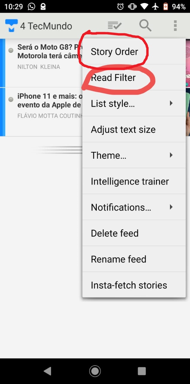
Also the Story Order box is in this same position (1), All the other other options are in the position (2), that’s why I think that having only 2 options that show’s up at position (1) are a bit weird. This is not a big deal anyway…