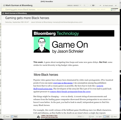
Since newsletters maintain their original formatting, they don’t always look the best and can be down right unreadable. For example, this Bloomberg newsletters is centred; which means it overflows and I cannot read it on the iphone. Even on my Mac, its not perfect as the formatting looks off.
Is there a way to strip some HTML formatting and/or have an option for using reader view on Newsletters?
Brilliant idea! I just launched the change so newsletters now have their full text extracted in the Text view. Thanks for bringing this to my attention!
1 Like
Perfect thanks for this!
But for me, the text extract is missing a lot of content. You can see as this is the newsletter I tried, which is missing text.
Would appreciate a follow up here @samuelclay
I’m not sure what else we can do, short of commiting to the Mercury Reader project which is performing text extraction. I tested it on a dozen newsletters and it worked for 11 of them. It’s hard to debug because newsletters are so far out of the ordinary for the text extractor, esp. because I would think it would work with ease. The reality is that there’s a lot of assumptions going into extracting text out of full web pages that are costly to remake for newsletters, so we’re stuck with this useful system with edge cases.
