Could you please create a new skin for the iOS apps (iPhone and iPad) with better contrast than the existing ones: I’d like black on white instead of shades of grey. The current one is hard to read.
2 Likes
This topic should be called “accessibility”.
Accessibility in the iPhone/iPad apps has gotten recently gotten even worse. (I don’t think my request of 2016 was ever addressed.)
To my eyes the major iPhone/iPad app supdate of a week or two ago resulted in fonts that are even paler greys than before and thinner (finer) as well.
This is not great for people who don’t have perfect vision.
It would be great if the mobile apps could offer a black and white high visibility option. Or at least very dark greys. The 4 currently-available themes all have very poor contrasts.
(NewsBlur is great! Except for this.)
I figured by having two dark color options, we could address the low contrast and high contrast preferences. So let’s assume you’re in the darker of the two dark themes. Which labels or view have low contrast? In my eyes, this is quite legible:
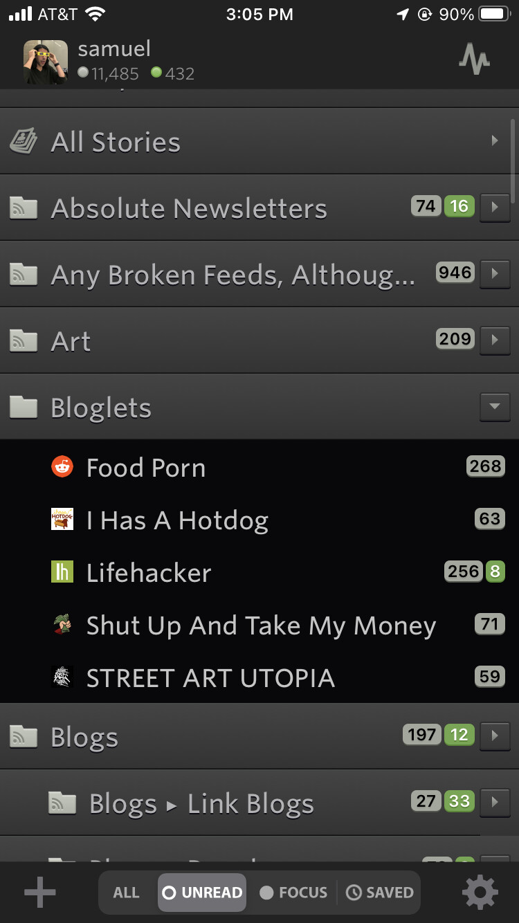
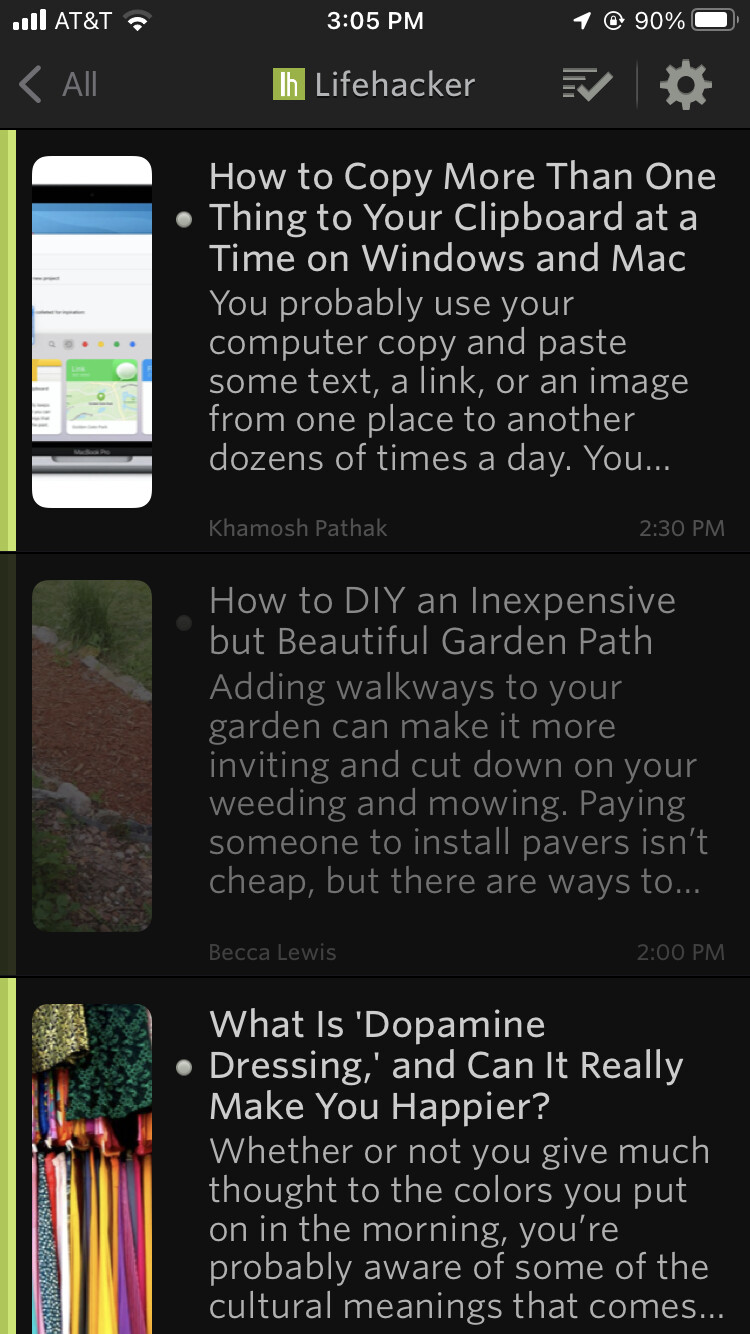

It’s great to have theme choice, but on my iPad they all have roughly equally poor contrast.
To my eyes the contrast of most text is poor, and the contrast of the read (as opposed to unread) items (thumbnail text) in the “second” column is very poor. Examples below.
Take a look at the iPad/iPhone Mail app. It’s very high contrast so very clear and easy to read. That’s what I have in mind.
1 Like
The Newsblur mobile apps poor contrast (at least on Apple) is still a problem. A black and white theme would be really nice.
None of the other apps I use have this problem. Open almost any other app and you’ll see real blacks (or very, very dark greys) and real whites. I’m not sure why Newsblur thinks it needs to be different.
What about the other font choices? You have Whitney but Whitney can be lighter than the others. San Francisco will be a stronger choice.
Thanks. That helps with the story text (column 3), but that was never much of an issue. It does nothing for columns 1 and 2, which is where the egregious grey-on-grey appears.
But I appear to be the only one complaining about this so I should probably just suck it up. ![]()