The highlighting for the all/unread button that sits in the bottom left on dev seems the wrong way around to me.
On the current live, the selected state is styled to look depressed and the unselected state is styled to look raised. 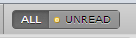
On dev it is the other way around, the selected state is styled to look raised, and the unselected state is styled to look depressed. 
In all the UI’s I’m used to I expect a toggle/radio style button to be styled as depressed when it selected, and thus I find the behavior on dev confusing as I’m constantly thinking I have the other state is selected.
If you’re after a highlight/non-highlight style rather than depressed the shading on the button probably needs looking at so that it doesn’t look like its depressed when it isn’t selected. Looking at the jquery UI toggle buttons, they seem to have opted for a simple raised look, whilst the select item is rendered with a flat style rather than depressed. jQuery UI radio button.
jQuery Mobile seem to have also chosen this style, only with the highlight more pronounced. jQuery Mobile radio button.