The launch of the new Premium Archive subscription tier also includes the 2022 redesign. You’ll see a third dashboard layout which stretches out your dashboard rivers across the width of the screen.
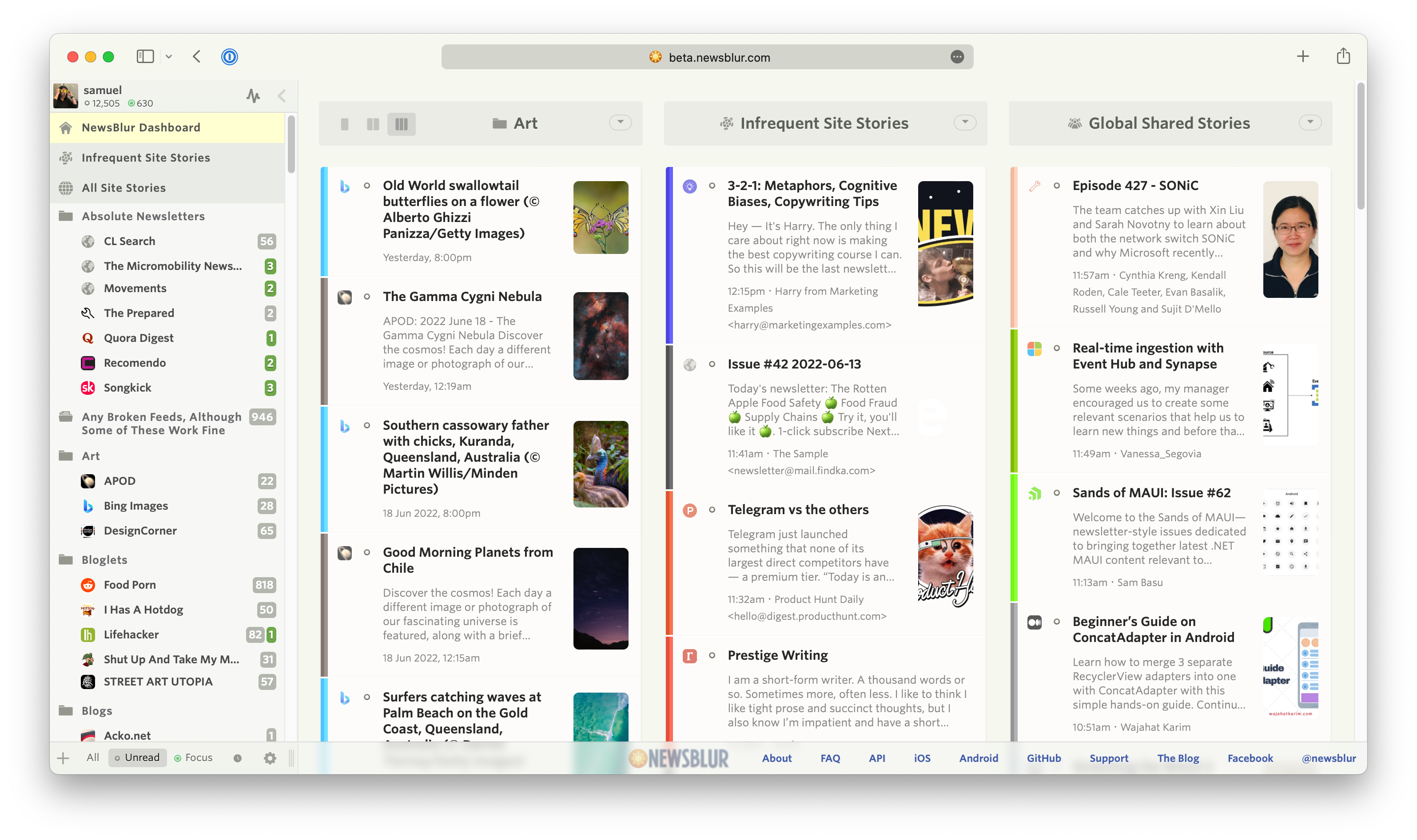
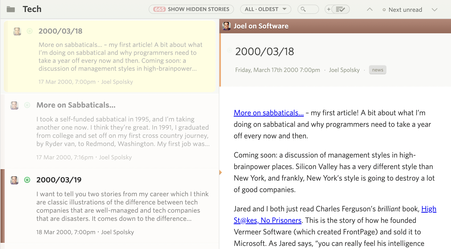
The latest redesign style has more accomodations for spacing and padding around each story title element. The result is a cleaner story title with easier to read headlines. The author has been moved and restyled to be next to the story date. Favicons and unread status indicators have been swapped, and font sizes, colors, and weights have been adjusted.
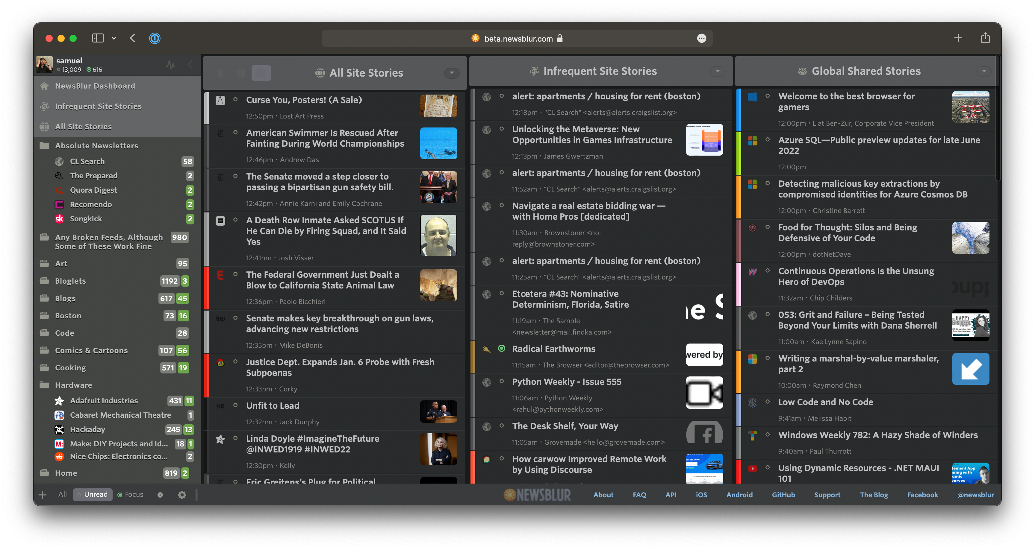
If you find the interface to be too airy, there is a setting in the main Manage menu allowing you to switch between Comfortable and Compact. The compact interface is denser than before, giving power users a highly detailed view.
Transitions have also been added to help you feel the difference. And there are new animations during many of the transitions that accompany changing settings.
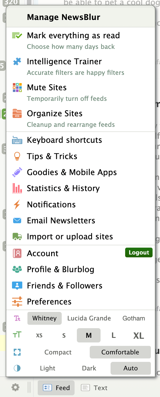
And lastly, this redesign comes with a suite of all new icons. The goal with this icon redesign is to bring a consistent weight to each icon as well as vectorize them with SVG so they look good at all resolutions.
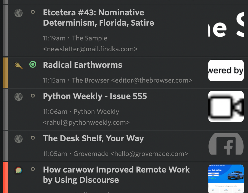
A notable icon change is the unread indicator, which now has different size icons for both unread stories and focus stories, giving focus stories more depth.
Here’s a screenshot that’s only possible with the new premium archive, complete with backfilled blog post from the year 2000, ready to be marked as unread.
I tried to find every icon, so if you spot a dialog or menu that you’d like to see given some more love, reach out on the support forum.
This is a companion discussion topic for the original entry at https://blog.newsblur.com/2022/07/01/dashboard-redesign-2022/